ソフトクラスタリング(Soft Clustering)とは、各データポイントが単一のクラスタに所属するのではなく、複数のクラスタに対する所属度を持つ手法です。ソフトクラスタリングは、データが明確に単一のクラスタに属さない場合や、クラスタ間の境界が曖昧な場合に有用です。実業務で人の行動ログを扱っている場合などに有効ではないかと考えています。
例えばアルバイト求人媒体のウェブサイトの分析をしている場合、サイトに訪問している求職者を複数のグループに分類したい場合があると思います。
検索軸で分けようとした場合、「事務作業系を検索している層」、「倉庫での勤務系を検索している層」などが出現してくると思いますが、ハードクラスタリングのように一律に特定のクラスタに割り当ててしまうと両方の職種を検討している人が考慮が難しくなってしまいます。(検索割合などの変数を使って個別データポイントの中身を確認すればハードクラスタリングでも判別は可能かも知れませんが)
クラスタの数を増やしていけば、「事務&倉庫系を検索している層」なんていうクラスタも出来上がるとは思いますがクラスタ数が増えるとその分複雑性が増していくと考えられます。
このような場合にソフトクラスタリングで、事務作業系のクラスタ系への所属割合が20%で、倉庫系が80%という形で分類してくれればより柔軟な分析が可能になりそうです。
ソフトクラスタリングの代表的な手法の一つは、Gaussian Mixture Model(GMM)です。GMMは、データを複数のガウス分布(正規分布)の混合としてモデル化します。
各ガウス分布は一つのクラスタを表し、データポイントはそれぞれのガウス分布に対する所属度(確率)を持ちます。
このため、データポイントは複数のクラスタに所属する確率を持ち、厳密なクラスタ割り当てが行われるのではなく、柔軟性を持ったクラスタリングが可能となります。
まとめるとソフトクラスタリングの利点は以下の通りです。
- 柔軟性: データポイントが明確な所属クラスタを持たない場合や、複数のクラスタに同時に影響される場合に適している。
- 確率的な情報: 各データポイントのクラスタ所属確率を提供するため、データの不確実性を考慮するのに役立つ。
- 密度ベースのクラスタリング: ガウス分布の混合を使用するため、データの密度に基づいたクラスタリングが可能。
それでは混合ガウスモデル(GMM)でソフトクラスタリングをやってみようと思います。
混合ガウスモデル(GMM)でソフトクラスタリング用のデータセット準備
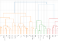
前回の記事で利用したAwA2のデータセットを使います。詳細は「Pythonで主成分分析とクラスタリング(階層型、非階層型)をやってみた。」をご確認ください。
# 描画用の設定
from matplotlib import rcParams
rcParams['font.family'] = 'Hiragino Sans' # Macの場合
#rcParams['font.family'] = 'Meiryo' # Windowsの場合
#rcParams['font.family'] = 'VL PGothic' # Linuxの場合
rcParams['xtick.labelsize'] = 12       # x軸のラベルのフォントサイズ
rcParams['ytick.labelsize'] = 12       # y軸のラベルのフォントサイズ
rcParams['axes.labelsize'] = 18        # ラベルのフォントとサイズ
rcParams['figure.figsize'] = 18,8      # 画像サイズの変更(inch)

BASE_DIR="/Users/hinomaruc/Desktop/blog/dataset/AwA2/Animals_with_Attributes2"
import pandas as pd
import numpy as np
import os
from IPython.display import display, HTML
from sklearn.decomposition import PCA

# 動物クラスの情報 (indexの情報として利用)
classes=pd.read_fwf(os.path.join(BASE_DIR,"classes.txt"), header=None)[1].values
# 属性情報名 (columnの情報として利用)
feature_names=pd.read_fwf(os.path.join(BASE_DIR,"predicates.txt"), header=None)[1].values
# 各動物クラスの属性情報 (データの中身)
features = pd.read_fwf(os.path.join(BASE_DIR,"predicate-matrix-continuous.txt"), header=None)
# データフレームの作成
df_animals_attributes = pd.DataFrame(data=features.values,index=classes,columns=feature_names)

# PCA
X = df_animals_attributes.values
pca = PCA(n_components=2)
X_pca = pca.fit(X).transform(X)

print("Before: X.shape",X.shape)
print("After: X_pca.shape",X_pca.shape)Before: X.shape (50, 85) After: X_pca.shape (50, 2)
分かりやすいようにPCAで2次元化したデータを使います。
GMMでソフトクラスタリングを実施
「sklearn.mixture.GaussianMixture」にGMMモデルのAPIが載っています。
from sklearn.mixture import GaussianMixture

# GMMモデルのコンポーネント数を指定 (後に紹介するBayesian Gaussian Mixtureだと最適化してくれる)
n_clusters = 8

# covariance_type: {‘full’, ‘tied’, ‘diag’, ‘spherical’}, default=’full’
gmm = GaussianMixture(n_components=n_clusters,covariance_type="full",random_state=1234)

# 学習
gmm.fit(X_pca)作成したモデルの確認
# 各ポイントの個々のクラスタへの所属割合を表示
gmm.predict_proba(X_pca)
array([[2.41637789e-047, 2.74014658e-002, 1.32777582e-043,
        7.73892920e-004, 9.71824641e-001, 1.94785054e-018,
        1.24589976e-123, 0.00000000e+000],
       [9.95104900e-001, 3.40225997e-056, 0.00000000e+000,
        4.48073878e-003, 1.13465435e-084, 4.12190736e-004,
        2.17053831e-006, 3.29891578e-056],
    ・・・省略・・・
       [1.30058007e-069, 1.36434600e-001, 2.20843928e-052,
        1.22659574e-006, 8.63564173e-001, 1.03322910e-020,
        1.40213314e-130, 0.00000000e+000],
       [2.21728223e-076, 5.34864262e-015, 9.99972756e-001,
        1.00877767e-034, 3.90729590e-123, 2.38936899e-005,
        7.62751475e-197, 3.35024591e-006]])
各クラスタへの所属確率が出せていそうです。コンポーネント数を8に設定したので、8つのクラスタへの所属確率がデータポイントごとに出力されています。
np.sum(gmm.predict_proba(X_pca), axis=1)
array([1., 1., 1., 1., 1., 1., 1., 1., 1., 1., 1., 1., 1., 1., 1., 1., 1.,
       1., 1., 1., 1., 1., 1., 1., 1., 1., 1., 1., 1., 1., 1., 1., 1., 1.,
       1., 1., 1., 1., 1., 1., 1., 1., 1., 1., 1., 1., 1., 1., 1., 1.])
各ポイントの所属割合の合計値は1になるようです。
cluster_assignments = gmm.predict(X_pca)
cluster_assignments
array([4, 0, 2, 5, 3, 3, 4, 0, 7, 0, 3, 3, 6, 1, 6, 4, 3, 7, 1, 3, 4, 6,
       4, 2, 3, 3, 3, 1, 3, 0, 4, 6, 0, 0, 0, 5, 1, 4, 3, 4, 6, 1, 0, 3,
       5, 3, 7, 0, 4, 2])
後で描画で利用するので変数に格納しておく
# サンプルデータも作成可能なようです。array[0]がデータポイント、array[1]が所属クラスタ番号です。
print(gmm.sample(n_samples=3))

# 各サンプルデータのクラスタ所属割合を確認したい場合はpredict_probaメソッドを使います
gmm.predict_proba(gmm.sample(n_samples=3)[0])
(array([[ -49.65888924,  -49.06390643],
        [ -25.80450766,  -22.18012025],
        [ -26.76233549, -115.66005146]]),
 array([3, 3, 4]))

array([[1.75988153e-010, 3.09509757e-016, 0.00000000e+000,
    1.00000000e+000, 5.94808651e-012, 4.90716477e-011,
    1.43898219e-067, 4.74208011e-160],
   [4.66576815e-012, 6.38590416e-017, 0.00000000e+000,
    9.99999782e-001, 1.91170226e-021, 2.17911029e-007,
    2.66319169e-038, 1.81613326e-106],
   [1.42212291e-031, 1.70671839e-004, 3.05941761e-174,
    6.56737352e-003, 9.93261955e-001, 4.41790710e-020,
    1.18645234e-153, 0.00000000e+000]])
後でデータの中身を確認できるようにクラスタリング結果をデータフレーム化する
# PCAの結果をデータフレーム化
df_X_pca = pd.DataFrame(X_pca,index=df_animals_attributes.index,columns=["Feature1","Feature2"])

# クラスタ番号付与
df_X_pca["Cluster"] = cluster_assignments

# クラスタ所属割合のデータフレーム化
gmm_col_name=["pct_clus0","pct_clus1","pct_clus2","pct_clus3","pct_clus4","pct_clus5","pct_clus6","pct_clus7"]
df_gmm_predict_proba = pd.DataFrame(gmm.predict_proba(X_pca),index=df_animals_attributes.index,columns=gmm_col_name)

# 結果としてまとめる
df_gmm_result = pd.concat([df_X_pca, df_gmm_predict_proba], axis=1)

# 1件だけ表示
df_gmm_result.head(1)
           Feature1     Feature2    Cluster     pct_clus0   pct_clus1   pct_clus2   pct_clus3   pct_clus4   pct_clus5   pct_clus6   pct_clus7
antelope    14.332003   -106.359925     4   2.416378e-47    0.027401    1.327776e-43    0.000774    0.971825    1.947851e-18    1.245900e-123   0.0
GMMの結果を描画する
描画パートが一番楽しいですね。GMMではcovariance_typeと呼ばれる共分散の種別を決めるパラメータが存在します。
covariance_type{‘full’, ‘tied’, ‘diag’, ‘spherical’}, default=’full’
String describing the type of covariance parameters to use. Must be one of:
‘full’: each component has its own general covariance matrix.
‘tied’: all components share the same general covariance matrix.
‘diag’: each component has its own diagonal covariance matrix.
‘spherical’: each component has its own single variance.
引用: https://scikit-learn.org/stable/modules/generated/sklearn.mixture.GaussianMixture.html
設定によって各クラスタの重なり具合などに変化が生じます。基本デフォルトのままで目的によってsphericalなど他の設定を試してみるといいかと思います。
scikit-learnのGMMのセクションにアイリスのデータセットによるcovariace_typeの例がありましたので引用しておきます。
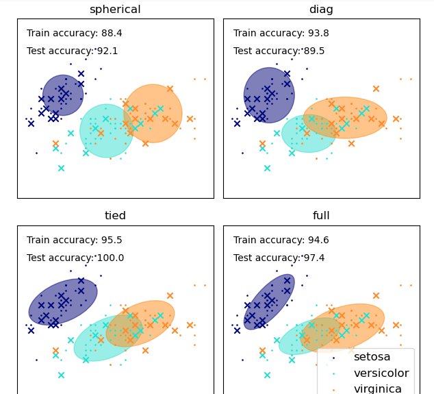
covariance_type描画用のmake_ellipsesという関数も載っていたので少しだけ改良して汎用的に使えるように今回使用させていただきました。
# 参考: https://scikit-learn.org/stable/auto_examples/mixture/plot_gmm_covariances.html
def make_ellipses(gmm, ax, colors, uniq_cluster_numbers):
    for n, color in zip(uniq_cluster_numbers, colors):
        if gmm.covariance_type == "full":
            covariances = gmm.covariances_[n][:2, :2]
        elif gmm.covariance_type == "tied":
            covariances = gmm.covariances_[:2, :2]
        elif gmm.covariance_type == "diag":
            covariances = np.diag(gmm.covariances_[n][:2])
        elif gmm.covariance_type == "spherical":
            covariances = np.eye(gmm.means_.shape[1]) * gmm.covariances_[n]
        v, w = np.linalg.eigh(covariances)
        u = w[0] / np.linalg.norm(w[0])
        angle = np.arctan2(u[1], u[0])
        angle = 180 * angle / np.pi  # convert to degrees
        v = 2.0 * np.sqrt(2.0) * np.sqrt(v)
        ell = plt.matplotlib.patches.Ellipse(gmm.means_[n, :2], v[0], v[1], angle=180 + angle, color=color)

        ell.set_clip_box(ax.bbox)
        ell.set_alpha(0.5)
        ax.add_artist(ell)
        ax.set_aspect("equal", "datalim")

import matplotlib.pyplot as plt
from adjustText import adjust_text

# 描画用に作成クラスタ情報を変数に格納
uniq_cluster_assignments = np.unique(cluster_assignments)
n_clusters=np.size(uniq_cluster_assignments)

# 散布図の作成
plt.scatter(X_pca[:, 0], X_pca[:, 1], c=cluster_assignments, cmap='viridis',s=50)

# クラスタに割り当てた色の情報を格納
colormap = plt.get_cmap('viridis', n_clusters)
cluster_colors = [colormap(i) for i in range(n_clusters)]

# 共分散楕円の作成
make_ellipses(gmm, plt.gca(), cluster_colors, uniq_cluster_assignments)

plt.xlabel('Feature 1')
plt.ylabel('Feature 2')
plt.title('Gaussian Mixture Model Clustering with Covariance Ellipses')

# 凡例を追加
legend_labels = [f'Cluster {i}' for i in range(n_clusters)]
legend_handles = [plt.Line2D([0], [0], marker='o', color='w', markerfacecolor=cluster_colors[i], markersize=10, label=legend_labels[i]) for i in range(n_clusters)]
plt.legend(handles=legend_handles, title='Cluster Numbers', loc='lower right')

texts = []
# 各プロットにクラス名を追加。ラベル配置調整用にリストにも追加。
for idx,aclass in enumerate(classes):
    texts.append(plt.text(X_pca[idx, 0], X_pca[idx, 1], aclass, fontsize=9, ha='center', va='bottom'))

# ラベル位置の調整 (pip install adjustText 必要)
adjust_text(texts)

# グリッド追加
plt.grid(True)

# 描画
plt.show()
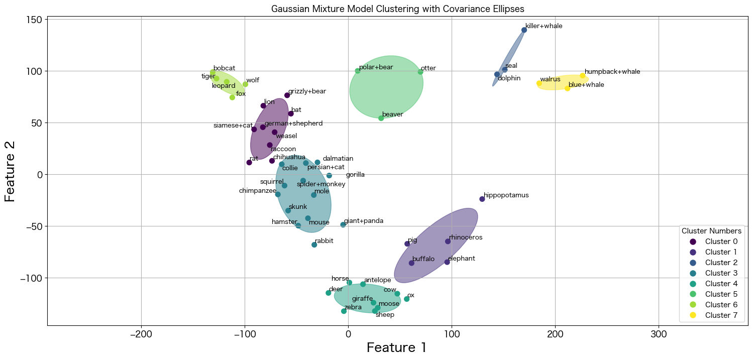
とても美しい描画結果が作成出来ました。ほとんど綺麗に分類されていますが、チワワだけ微妙な立ち位置にプロットが存在します。
racoonとcollieの間みたいですが、この場合どうなっているのか確認したいと思います。
# collieのデータを確認
df_gmm_result[df_gmm_result.index.isin(["chihuahua"])].transpose()
              chihuahua
Feature1    -7.359635e+01
Feature2    1.288584e+01
Cluster     0.000000e+00
pct_clus0   5.149982e-01
pct_clus1   4.181926e-38
pct_clus2   0.000000e+00
pct_clus3   4.850013e-01
pct_clus4   1.150488e-39
pct_clus5   5.763205e-07
pct_clus6   2.649160e-19
pct_clus7   6.705864e-73
クラスタ0への所属確立が0.515で、クラスタ1への所属確率が0.485のようです。描画結果がきちんと反映されていそうです。
ベイジアン混合ガウスモデル(Bayesian Gaussian Mixture model)を試してみる
GMMだとコンポーネント数を自分で設定しないといけませんでしたが、Bayesian GMMだと効果的なコンポーネント数をデータから推測してくれるようです。
This class allows to infer an approximate posterior distribution over the parameters of a Gaussian mixture distribution. The effective number of components can be inferred from the data.
引用: https://scikit-learn.org/stable/modules/generated/sklearn.mixture.BayesianGaussianMixture.html
ベイジアン混合ガウスモデル作成
from sklearn.mixture import BayesianGaussianMixture

bgmm = BayesianGaussianMixture(
    n_components=8,
    covariance_type="full",
    #weight_concentration_prior=1e-2,
    #weight_concentration_prior_type="dirichlet_process",
    #max_iter=10000,
    random_state=1234
)
bgmm.fit(X_pca)
自動でやってくれるならn_componentsの指定はいらないかなと思い、デフォルト値を使っていましたが、デフォルト値=1だったので、設定しないと全てのクラスタが0に割り当てられてしまいました。
どうやらn_componentsは1より大きいサイズを指定しておき、Bayesian GMMに最適化してもらえば良いようです。データとweight_concentration_priorの値を元に必要ないコンポーネントのweights_を限りなく0に設定することで設定したn_componentsより少ない数を最終的に採用してくれるようです。
今回n_componentsはGMMで指定した8を設定しておきます。
The number of mixture components. Depending on the data and the value of the weight_concentrationprior the model can decide to not use all the components by setting some component weights to values very close to zero. The number of effective components is therefore smaller than n_components.
引用: https://scikit-learn.org/stable/modules/generated/sklearn.mixture.BayesianGaussianMixture.html
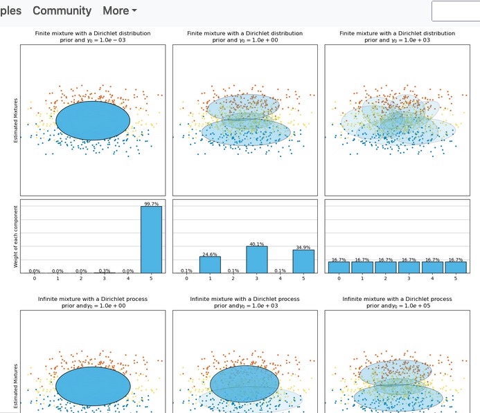
詳細は「Variational Bayesian Gaussian Mixture」の項目にありました。weight_concentration_prior_typeとweight_concentration_priorの調整によりクラスタがどう変化するかも下記のようなサンプルがありました。
Bayesian BMMでのソフトクラスタリング結果を描画
make_ellipses関数はBayesian Gaussian Mixtureも描画できるように改良してあるので、GMMで使ったものをそのまま使えます。
import matplotlib.pyplot as plt
from adjustText import adjust_text

cluster_assignments = bgmm.predict(X_pca)
uniq_cluster_assignments = np.unique(cluster_assignments)
n_clusters=np.size(uniq_cluster_assignments)

# 散布図の作成
plt.scatter(X_pca[:, 0], X_pca[:, 1], c=cluster_assignments, cmap='viridis',s=50)

# クラスタに割り当てた色の情報を格納
colormap = plt.get_cmap('viridis', n_clusters)
cluster_colors = [colormap(i) for i in range(n_clusters)]

# 共分散楕円の作成
make_ellipses(bgmm, plt.gca(), cluster_colors, uniq_cluster_assignments)

plt.xlabel('Feature 1')
plt.ylabel('Feature 2')
plt.title('Bayesian Gaussian Mixture Model Clustering with Covariance Ellipses')

# 凡例を追加
legend_labels = [f'Cluster {i}' for i in range(n_clusters)]
legend_handles = [plt.Line2D([0], [0], marker='o', color='w', markerfacecolor=cluster_colors[i], markersize=10, label=legend_labels[i]) for i in range(n_clusters)]
plt.legend(handles=legend_handles, title='Cluster Numbers', loc='lower right')

texts = []
# 各プロットにクラス名を追加。ラベル配置調整用にリストにも追加。
for idx,aclass in enumerate(classes):
    texts.append(plt.text(X_pca[idx, 0], X_pca[idx, 1], aclass, fontsize=9, ha='center', va='bottom'))

# ラベル位置の調整 (pip install adjustText 必要)
adjust_text(texts)

# グリッド追加
plt.grid(True)

# 描画
plt.show()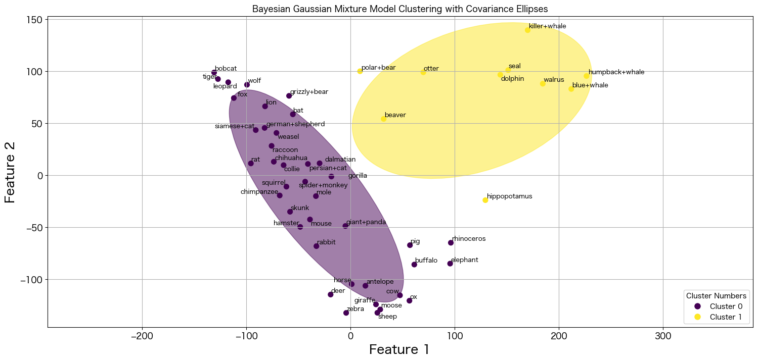
n_componetsは8に設定したのに、クラスタ数は2になりましたね。Bayesian GMMによって最適化出来ているようです。
陸の哺乳類生物、海の哺乳類生物で分類されたように見えますね 笑
今回は2つに最適化されましたが、シードを変更したりパラメータを調整することによりまた異なる分かれ方になると思います。
※ 試しにシードを4649にしたら3つに分類されました。
まとめ
今回は混合ガウスモデル(Gaussian Mixture Model)とベイジアン混合ガウスモデル(Bayesian Gaussian Mixture)を試してソフトクラスタリングをしてみました。
柔軟性の高いモデルで個人的に好きなモデルの一つになりました 笑
GMMもBayesian GMMも試すことはそんなに難しくなかったので、K-meansやった後に試してみるなどしてみるといいかも知れません。
次は潜在クラスモデルを試してみようと思います。(勉強からになってしまうので時間かかるかも知れません)