前回の続きで、アップル引越しのデータの中身を確認していきたいと思います。

import pandas as pd
# 訓練データと予測付与用データの読み込み
df = pd.read_csv("/Users/hinomaruc/Desktop/blog/dataset/applehikkoshi/train.csv",parse_dates=['datetime'],index_col='datetime')
df_test = pd.read_csv("/Users/hinomaruc/Desktop/blog/dataset/applehikkoshi/test.csv",parse_dates=['datetime'],index_col='datetime')
# 上から5件のデータを確認
df.head()
y client close price_am price_pm datetime 2010-07-01 17 0 0 -1 -1 2010-07-02 18 0 0 -1 -1 2010-07-03 20 0 0 -1 -1 2010-07-04 20 0 0 -1 -1 2010-07-05 14 0 0 -1 -1
# infoメソッドでデータの概要を把握
df.info()DatetimeIndex: 2101 entries, 2010-07-01 to 2016-03-31 Data columns (total 5 columns): # Column Non-Null Count Dtype --- ------ -------------- ----- 0 y 2101 non-null int64 1 client 2101 non-null int64 2 close 2101 non-null int64 3 price_am 2101 non-null int64 4 price_pm 2101 non-null int64 dtypes: int64(5) memory usage: 98.5 KB
# カラム名を確認
df.columnsIndex(['y', 'client', 'close', 'price_am', 'price_pm'], dtype='object')
# 描画設定
from IPython.display import HTML
import seaborn as sns
from matplotlib import ticker
import matplotlib.pyplot as plt
sns.set_style("whitegrid")
from matplotlib import rcParams
rcParams['font.family'] = 'Hiragino Sans' # Macの場合
#rcParams['font.family'] = 'Meiryo' # Windowsの場合
#rcParams['font.family'] = 'VL PGothic' # Linuxの場合
rcParams['xtick.labelsize'] = 12       # x軸のラベルのフォントサイズ
rcParams['ytick.labelsize'] = 12       # y軸のラベルのフォントサイズ
rcParams['axes.labelsize'] = 18        # ラベルのフォントとサイズ
rcParams['figure.figsize'] = 18,8 # 画像サイズの変更(inch)時系列データをグラフで確認する
いつも通りデータの中身を見てみたいと思います。
引越し数(y)の確認 (全期間)
sns.lineplot(data=df, x=df.index, y="y", hue="close")
plt.xticks(rotation=90)
plt.title('hikkoshi-cnt')
plt.show()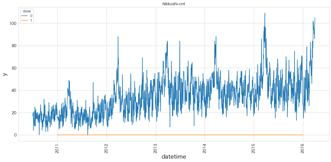
closeは休業日なので引っ越しはしないはず。ということでhueにcloseカラムを指定して営業日と休業日を分けて表示させてみました。
おそらく3月でしょうか?スパイクが毎年あって、数値も全体的に右肩傾向にあるようです。各年ごとに確認してみます。
引越し数(y)の確認 (年ごと)
# 2011 ~ 2015のデータを表示
for idx, yyyy in enumerate(range(2011,2016), 1):

    plt.subplot(3,2,idx)
    sns.lineplot(data=df[df.index.year == yyyy], x=df[df.index.year == yyyy].index, y="y", hue="close")
    if idx <= 3:
        plt.xticks([])
        plt.xlabel("")
    plt.title('hikkoshi-cnt')
    plt.xticks(rotation=90)

plt.show()

# 2010と2016のデータ (一年分ないので分けてグラフ化した)
plt.subplot(1,2,1)
sns.lineplot(data=df[df.index.year == 2010], x=df[df.index.year == 2010].index, y="y", hue="close")

plt.title('hikkoshi-cnt')
plt.xticks(rotation=90)

plt.subplot(1,2,2)
sns.lineplot(data=df[df.index.year == 2016], x=df[df.index.year == 2016].index, y="y", hue="close")

plt.title('hikkoshi-cnt')
plt.xticks(rotation=90)
plt.show()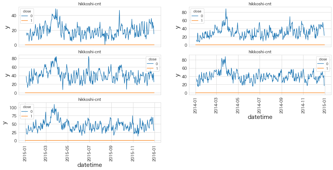
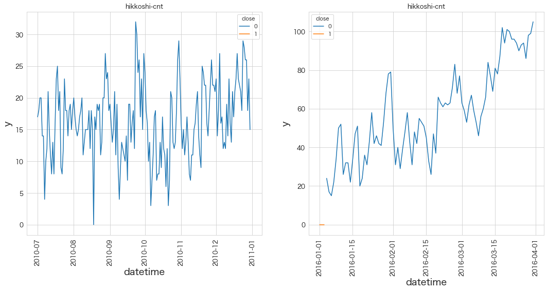
やはり3月に引っ越し数が多くなるようです。
法人が絡む特殊な引越し日フラグ(client) の確認
sns.lineplot(data=df, x=df.index, y="client")
plt.xticks(rotation=90)
plt.title('client')
plt.show()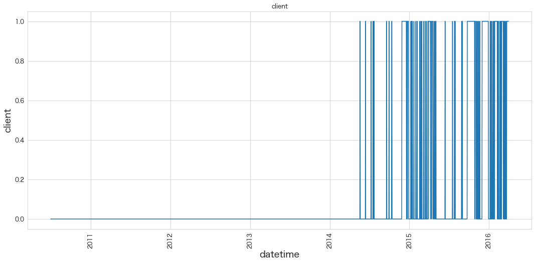
2014年からしか出現していないようです。
休業日(close)の確認 (グラフ)
sns.lineplot(data=df, x=df.index, y="close")
plt.xticks(rotation=90)
plt.title('close')
plt.show()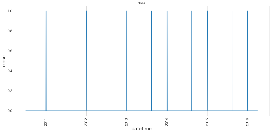
定期的にあるようです。これだけだと分かりにくいので表で確認してみます。
休業日(close)の確認 (表形式)
df.query("close == 1")
y client close price_am price_pm datetime 2010-12-31 0 0 1 -1 -1 2011-01-01 0 0 1 -1 -1 2011-01-02 0 0 1 -1 -1 2011-01-03 0 0 1 -1 -1 2011-12-31 0 0 1 -1 -1 2012-01-01 0 0 1 -1 -1 2012-01-02 0 0 1 -1 -1 2012-01-03 0 0 1 -1 -1 2012-12-31 0 0 1 -1 -1 2013-01-01 0 0 1 -1 -1 2013-01-02 0 0 1 -1 -1 2013-01-03 0 0 1 -1 -1 2013-08-12 0 0 1 -1 -1 2013-12-31 0 0 1 -1 -1 2014-01-01 0 0 1 -1 -1 2014-01-02 0 0 1 -1 -1 2014-01-03 0 0 1 -1 -1 2014-08-12 0 0 1 -1 -1 2014-12-31 0 0 1 -1 -1 2015-01-01 0 0 1 -1 -1 2015-01-02 0 0 1 -1 -1 2015-01-03 0 0 1 -1 -1 2015-08-12 0 0 1 -1 -1 2015-12-31 0 0 1 -1 -1 2016-01-01 0 0 1 -1 -1 2016-01-02 0 0 1 -1 -1 2016-01-03 0 0 1 -1 -1
年末年始と8/12が2013年から休業日のようです。
8/12は毎年アップル引越しセンターの社員が集まる日だったのでしょうか?
今年は8/23(火)が休業日のようです。
図: アップル引越しセンターのホームページより抜粋 (22/08/20)

会社を休みにしてまで研修するなんてとても社員のことも考えてくれているいい会社さんですね。
午前の料金区分(price_am)と午後の料金区分(price_pm)の確認
import matplotlib.pyplot as plt

plt.subplot(1,2,1)
sns.lineplot(data=df, x=df.index, y="price_am")

plt.subplot(1,2,2)
sns.lineplot(data=df, x=df.index, y="price_pm")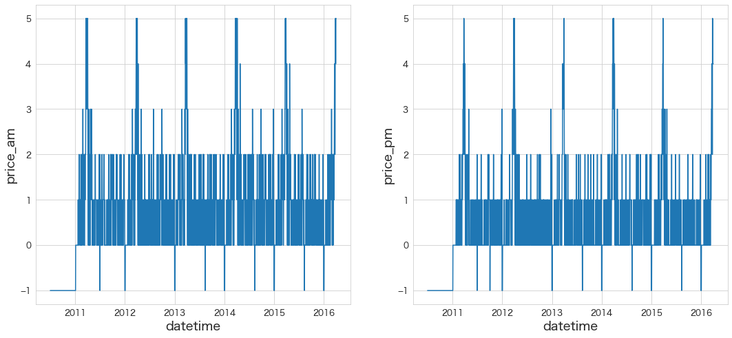
PMの方が安めの料金設定になっているように見えます。lineplotよりcountplotやhistplotの方が見やすそうなので確認してみます。
import matplotlib.pyplot as plt

plt.subplot(1,2,1)
sns.histplot(data=df, x="price_am",stat="percent",color="b")

plt.subplot(1,2,2)
sns.histplot(data=df, x="price_pm",stat="percent",color="r")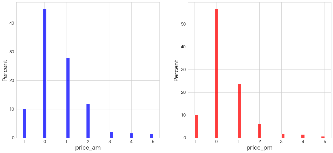
・やはりAMの方が値段が高い傾向にありそうです (0の割合がprice_amの方がprice_pmより低い)。同じ表に2つのグラフを横並びに表示した方が分かりやすかったかも知れません。
まとめ
データの理解が進みました。右肩あがりに引っ越し数が伸びているのと3月に季節性があることは時系列を予測をする上でポイントになりそうです。
また休業日も決まっているようなので考慮してあげる必要があるかも知れません。
次回からは時系列モデルを色々試してみたいと思います。
データ加工は必要であれば時系列モデルを作成する中でやっていきます。